Discover why we push red buttons and how design elements influence user behavior and improve interaction experiences.
Suggested by our brains as we interact with the environment, and perfected by evolution, intuition on a daily basis is one of our best allies, giving us cues of how things should work without previous knowledge.
Before diving deep, let’s start with the basics.
Affordances 101
UX designers left the chat…
An affordance is a single attribute of an object, which invites the user to carry out an action.
A quick way to understand affordances is by thinking of all the potential uses we might find for an object. So basically, affordances are all around us. The reason why we grab (hot) coffee mugs from the handle and not from the cup, push and pull doors, and why we know how to roll but not kick a bowling ball is the effect of how our brain delivers us cues (affordances) to accurately assume how things should work.
How do we know we can do all of this? Because of their physical properties.
Physical properties play a key role to help us understand what are the affordances these objects have. Size, material, and shape for example will let us know if you can grab and throw the ball, or instead, roll it through the floor. These physical properties can help us understand what objects can do.
Affordance and luxury cars
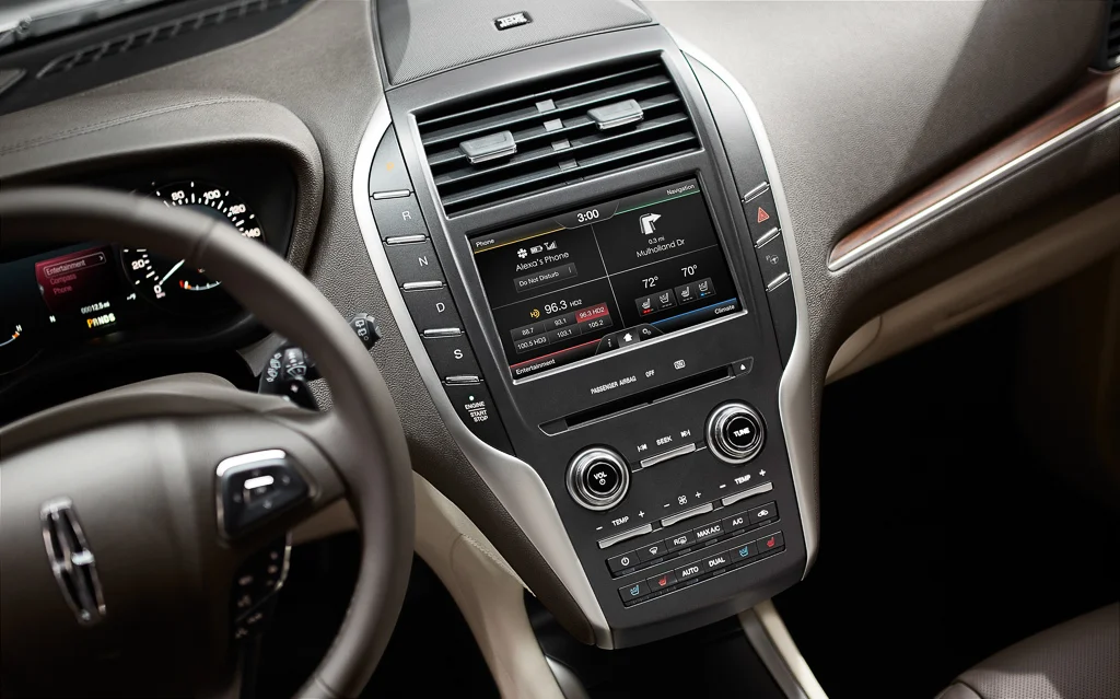
In 2015, a button design may have cost the American brand Lincoln some bucks in their revenue after recalling from the market 13,574 cars because the engine start/stop button had to be moved. Why? -you may ask yourself- Well, it seemed like the drivers accidentally pushed the stop button while driving at full speed and I think everyone knows it’s not safe to turn off your vehicle while driving.
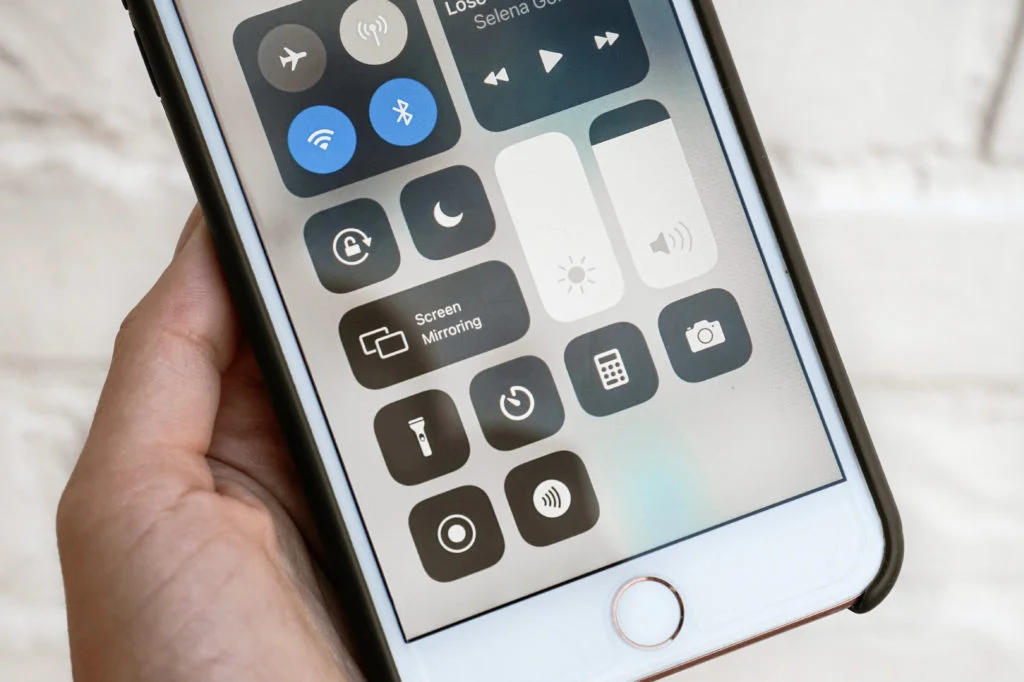
Affordances in the physical world are evident, their physical attributes provide hints of what you can do with them. In most cases, objects have a perceptible affordance, as their characteristics imply a specific action. That feeling we get when we look at a switch, a knob, or a red button.

A red button affords to be pushed, due to its shape, its color, and a pre-existing convention in human culture of pushing it when you are told not to.
Designing affordances with the user experience in mind
In a digital environment, objects don’t directly influence human perception due to the lack of a 3-dimensional space in which we can interact with it easily. The job of a designer is to use visual cues to create objects/elements that produce an almost natural response by the user.
In 1988, Don Norman took the lead in implementing affordances in the context of human-computer interaction. Norman emphasized the need for explicit visual cues demonstrating the user what can they do with a certain device or widget within an interface.
- Interactive Elements
- Scrollbars
- Command Buttons
- Links
- Icons
The previous are basic examples of elements that can be designed to help give the user sufficient suggestions of how they can interact with a digital interface.
What types of digital affordances can we find?
In a physical state, it is pretty straightforward to identify obvious affordances around your surroundings. The digital playground is a whole different experience, cues for the user to use the digital space intuitively are harder to provide on behalf of the designer as contrary to the real world.
1. Explicit affordances: Provide tangible cues with pretty straightforward actions for the user to notice. Labels are one example as they can indicate the functionality of a specific element.
2. Metaphorical: Sometimes thinking about real-life references can be a great idea if you are not sure how to carry out a certain functionality. They make clever use of skeuomorphism design to convey the functionality of digital objects making a relationship with a similar real-life object. For example, a floppy disk icon will tell users that it’s a save button.
3. Patterns: Created mostly by users who frequently interact around the web establishing conventions. These affordances are fueled up by the user’s preferences. For example, clicking on a company’s website logo is an effective way of returning to the website’s home page. There is no logical reason behind this, taking into account the company’s logo doesn’t give any specific hint of this action, but still has been established as a convention across the internet. Using common patterns will help you meet users’ expectations.
4. Implicit/Hidden: These affordances are not that obvious for the human eye. These usually remain hidden until the user makes a certain action. One example is usually a drop-down menu that appears while hovering or clicking.
5. False: They suggest the user performs a particular action that will lead to a specific outcome, but, upon completing the action, either nothing or something unexpected happens. For example, an underlined text that isn’t a link.
6. Negative: This type of affordance indicates when you don’t have an affordance. An example of this is when you want to indicate that you can’t do an action, perhaps having a disabled button that doesn’t let you continue until you fill out all your form.
How can affordances impact radically on your user experience?
The role of UX in the digital transformation journey is to design expertly crafted and intuitive human-computer experiences that both engage and delight end-users. Through the knowledge and implementation of affordances, the user experience can be refreshing and intuitive or a messy and confusing nightmare, and because of this, it may be a tricky task. Users cannot carry desired actions if the objects do not afford them to. So we insist that UX designers MUST build web and mobile interfaces where users shouldn’t think twice about what they are doing.
“When affordances are taken advantage of, the user knows what to do just by looking: no picture, label, or instruction needed.” - Don Norman, Grand Old Man of User Experience
By understanding how users think, designers may implement the correct elements to produce the desired outcome on behalf of the user.
Mark Zuckerberg strongly approves
How can affordances add value to your business?
Now more than ever, the digital era is upon us with great pressure on business owners to adapt to the increasing demand for digital solutions that make people’s life easier every day. Companies must invest in modern and efficient solutions to adapt their business operations to the market trend.
A key element of the success of these investments is how well are received these new tools by the consumer. The level of satisfaction that is perceived by a consumer when using a digital service may refer directly to the user experience. Digital solutions must not focus only on delivering a good cost/benefit product to their consumers but also on making them easy and intuitive to use. After all, what good is having the latest and greatest technology if no one understands how to use it?
So… Why do we push red buttons?
Affordances are everywhere. As we shop, browse, interact, play, and learn, in other words, they shape how we see our world. Designers across all industries, from experts to first-timers, must have affordances in mind to create self-explanatory objects. Acknowledging affordances by following established conventions when designing digital interfaces, will speak directly to a user and help build a memorable and lasting experience.
This is essential in the emerging digital era, because it provides guidelines to users, for them to easily adapt to technological change. A strategy that includes user-led design will ensure your designs, communicate the affordances that best meet your end user’s needs, and will most likely ensure the intent of the application is perceived and actionable for all users.
The reason why we push red buttons is the same as why millionaires buy expensive and luxurious goods because they can afford it.
Join 2000+ Founders and Developers crushing their businesses and careers with monthly advice. You can also follow us on LinkedIn , Twitter & Instagram!