Book a Call
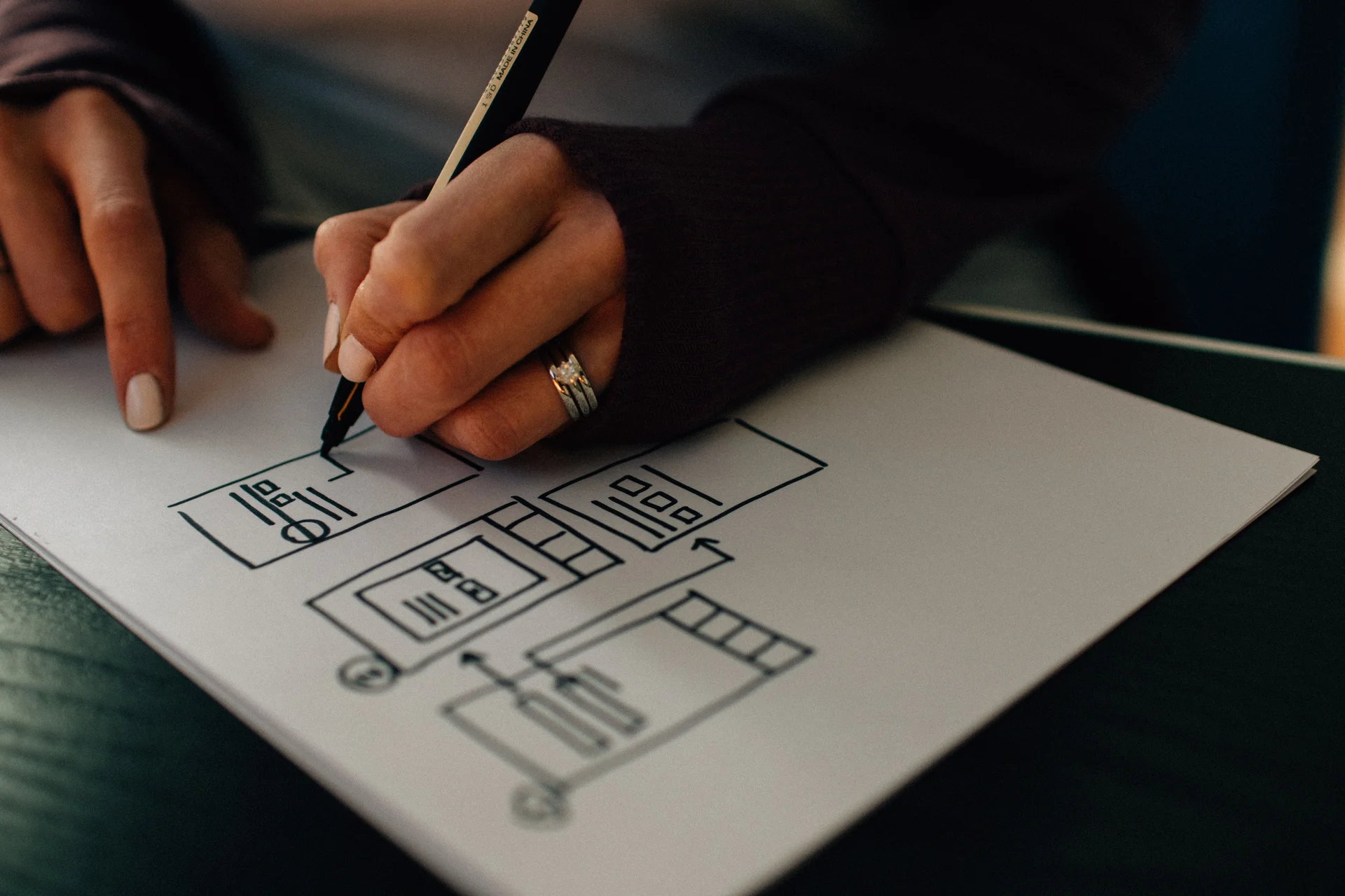
Explore the principle of ‘Good Design Is As Little Design As Possible.’ Discover our top tips for achieving a minimalist and effective design.
Designing a powerful app and keeping it simple at the same time is a hard task. Use cases, features, flows & interaction patterns add in to possibly turn your experience into a mess. But as designers & app makers, what can we do?
A couple of days ago I came across a great quote from Dieter Rams:
Good design is as little design as possible. Less, but better - because it concentrates on the essential aspects, and the products are not burdened with non-essentials. Back to purity, back to simplicity.
The answer sounds, well, simple: keep it simple.
Easier said than done though. Once you are sitting in front of a 10-pager spec sheet there is just no way in hell you can design something simple right? Turns out you can. You always can.
5 things to keep it simple
- Cut out all ‘nice to haves’ from the spec sheet
- Cut out all non-essentials from the spec sheet
- Stick to a simple color palette
- You don’t need flashy gradients, shadows, images, etc.
- Stick to known interaction patterns and interface elements
- Don’t burden the screen, stick to one interaction per screen
If you’re constantly adding in elements to make your app stand out, you’re not solving a problem, you’re just building an app for your portfolio.
A couple of great examples
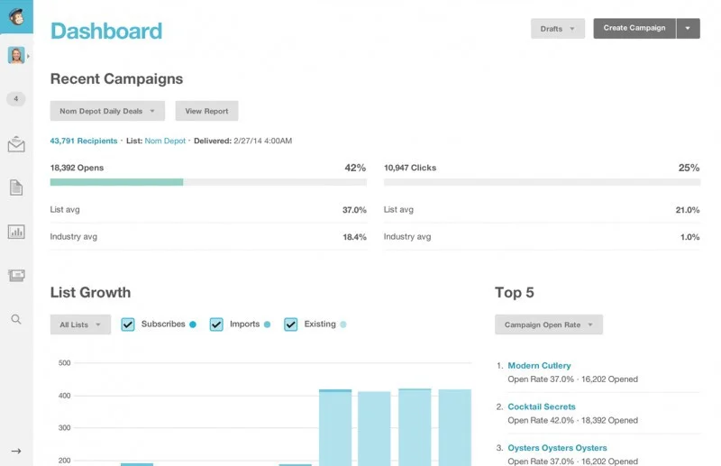
Mailchimp — The powerful email & campaign app has hundreds of features yet they keep it super simple to use, uncluttered and fully responsive.
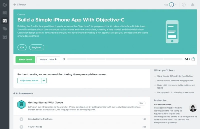
Treehouse — the tech online learning website has hundreds of courses, a large community and thousands of downloadable documents. Yet, the keep it simple. The interface is straight forward, no learning curve and they keep you focused on one thing at a time.
KISS
There’s a reason why Apple products sell massively: they keep it simple stupid. The Kiss principle coned by the US Navy back in the 60’s still stands true: avoid complexity to build a better product.
Have you used any over complex, horrible app recently? Let’s break them down below!
We place senior UX/UI designers from Latin America who keep US products this simple. Follow us on LinkedIn , Twitter & Instagram!