
Learn what a Sprint Burndown Chart is and how to use it effectively. Discover how this tool can help you track progress and manage your projects efficiently.
Does anyone know why we learned to recite the periodic table of elements by memory? Do you even recall what “Sm” stands for?
Yes, there are a lot of useless things we learn through our lives, and that’s how I used to feel about Burndown charts until recent weeks. Now that I know the true meaning and how useful they are, Burndown charts have become one of my most precious tools in Project Management.
So, what the heck is it?
A Burndown Chart is the graphic representation of your team’s velocity; it shows how quickly (or slowly) the team is working through the sprint’s user stories. So, it compares the total effort of the team against the amount of work for each iteration (sprint) and the cost of the overall effort, resulting in understanding your total runway.
The Burndown chart should be shared regularly during the sprint so everyone can notice the progress and tell whether or not they will be able to complete the sprint, and, of course, take action to ensure this.
But, how should you read it?
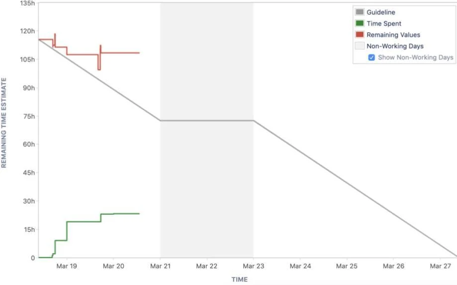
First, you will need to recall Cartesian planes, the x-axis, and the y-axis. For burndown charts, this is what each one means:
- X-axis (Horizontal): This is the timeline, usually the days that have passed from the beginning of your sprint.
- Y-axis (Vertical): This is the work that needs to be done by using the remaining time estimate (that’s why we need to estimate tasks as accurately as possible).
Start with good estimates
The product manager has given you a feature, and now, as the lead engineer, you need to estimate. Don’t guesstimate; make your best to do it as accurately as possible. How? Try this:
- Don’t wait until grooming to read the documentation; read it in advance
- Ask a lot of questions
- Ask for designs, and if not, call this out as it may impact your estimate
- Clarify the scope/restrictions and make sure everyone is aware
- If you don’t feel sure, better not accept it
How do the burned tasks get burned?
The chart uses closed tasks for decreasing the remaining effort, but what’s a closed task? You will need to set it up. Most of the PM tools have a scrum board with configurable columns where you can locate task statuses (To Do, In Progress, and Done). Whenever you move a task to the Done column, your Burndown chart will show less value for the remaining tasks. The goal is to get to zero at the end of your sprint.
Burndown charts need two key items from your sprint: estimates and Done tickets. This combination will set up your sprint for success or not. Make sure you estimate accurately with enough information, set up your PM tool to identify a really closed task, and this way you can rely on your Burndown chart to tell the feasibility of completing your sprint on time.
Being involved in a number of engineering projects with US-based clients, the engineering teams at Ideaware are very familiar with using burndown charts and understand their value and importance. Working with a burndown chart was instrumental in the success we achieved with US client Natiivo to support their luxury hospitality experiences.
Why Ideaware?
Since 2010, we’ve helped US companies scale with top-tier tech talent, not just by filling roles, but by becoming long-term partners in growth.
- We handle sourcing, hiring, onboarding, and retention.
- Start receiving CVs as soon as 48 hours.
- You could meet your new teammate in as little as 8–12 days.
- Our retention rates are 2x the industry average.
Contact us here to discuss your hiring strategy, and we will get in touch with you within 24 hours or less.